You stop obsessing over 2‑point nudges and start worrying about whether people can complete a task while they are tired, distracted, or on a shaky network connection. Pixel perfection used to feel like a badge of honor. In 2026, it feels more like a delay tactic.
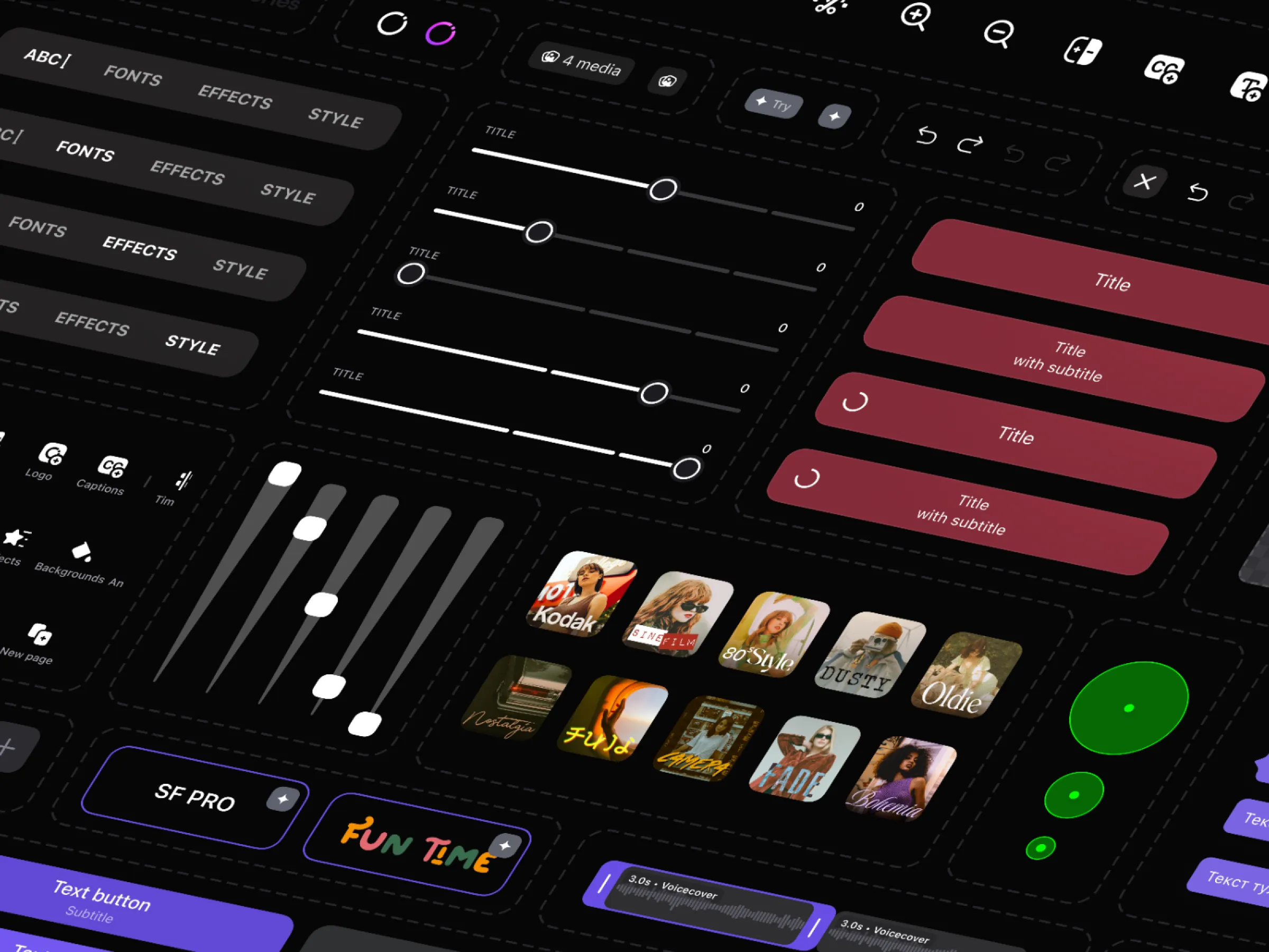
I remember the first time I spent three full days tweaking kerning on a button label. The client loved it. The users? They never noticed. That was 2018, back when we designers treated interfaces like museum pieces, polishing every shadow drop and corner radius until they gleamed under spotlight scrutiny. Fast forward to 2026, and that kind of pixel-pushing feels as outdated as floppy disks. AI tools spit out five layout variants from a single prompt before you finish your coffee. Figma's got smart duplicate. Midjourney dreams up entire design systems overnight. The craft we spent years mastering at the microscopic level? It's commoditized.
Don't get me wrong. I loved the zen of it, that flow state where time vanished into alignment grids and color picker debates. But here's the truth nobody said out loud back then: pixel perfection never shipped value. It shipped screenshots. Users don't magnify your app at 400% to admire your work. They swipe, tap, scroll, and bounce if it doesn't solve their problem in three seconds flat.
The shift nobody saw coming
What killed pixel perfect wasn't laziness or bad taste. It was velocity. Product teams in 2026 move at warp speed because the market does. TikTok clones your feature by Tuesday. Competitors A/B test your entire flow over lunch. When your job is to outpace entropy, not chase subpixel bliss, you learn to ship "good enough" interfaces that evolve weekly instead of annually. Rough edges become features. That slightly off-center icon? It adds warmth. The unpolished hover state? It feels human.
I saw this firsthand on a recent project. We prototyped a dashboard in 48 hours using AI-assisted components. Launch day, it had quirks, a gradient that bled on mobile, a sidebar that jittered once on hover. Engagement spiked 27% anyway. Why? Because it worked. Users found inventory faster, placed orders smoother. We iterated twice that week, fixing the real pain points while the "imperfect" bits stayed. Nobody complained about aesthetics. They thanked us for saving them time.
Judgment over janitorial work
This is where designers win now. AI handles the janitorial stuff, the endless variants and refinements. Your superpower is the stuff no prompt can nail: Does this flow reduce cognitive load for a tired parent checking email at midnight? Will this decision scale when we hit 10x users? Is this emotionally right for the moment?
Take onboarding. Old me would've obsessed over the progress bar's stroke weight. New me asks: what's the simplest path to "aha" moment? Sometimes it's a single microinteraction, not a 12-screen masterpiece. Sometimes it's zero screens, just voice or ambient awareness. Pixel perfect can't answer those questions. Strategic messiness can.
Proof in the wild
Look at Notion. Their magic isn't flawless typography, it's the blank page that bends to your chaos. Or Superhuman's email client, where speed trumps visual purity every time. Even Apple's Vision Pro interfaces prioritize spatial intuition over retina-sharp renders. These products dominate because they respect user context over designer ego.
A better way forward
So how do you adapt? Ship weekly, measure ruthlessly, obsess over behavior not beauty. Build prototypes that live in the wild, not in Figma purgatory. Train your eye for "feels right at 20 feet," not "perfect at arm's length." And yeah, keep some rituals. I still align to 8pt grids because muscle memory dies hard. But now they're scaffolding, not shackles.
Pixel perfect was a trap, a distraction from what matters. Good riddance indeed. The future belongs to designers who build products that work in the messy real world, not pristine mockups for Dribbble applause. Who's with me?